Bar Graph for Science: A Powerful Tool for Visualizing Scientific Data
Bar graphs play a critical role in science education and scientific communication because they transform raw data into clear, visual information that is easy to interpret. A bar graph for science is commonly used to compare quantities, show differences between categories, and highlight trends in experimental results. Whether students are measuring plant growth, comparing temperatures, or analyzing survey results, bar graphs help make scientific data meaningful.
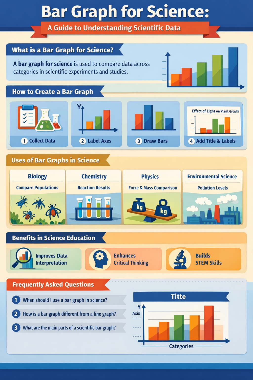
In science classrooms around the world, bar graphs are introduced early because they reinforce both mathematical and scientific thinking. They encourage students to organize observations, label variables correctly, and draw conclusions based on evidence. A bar graph typically consists of a horizontal axis (x-axis) that displays categories or groups, and a vertical axis (y-axis) that shows numerical values such as frequency, amount, or measurement units. Each bar represents a category, and the height or length of the bar corresponds to the data value.
From a scientific perspective, bar graphs are especially useful when data does not change continuously. For example, comparing the number of animals in different habitats, types of soil samples, or test results across different groups are all ideal situations for using a bar graph for science. Unlike line graphs, which emphasize change over time, bar graphs focus on comparison, making them essential for experiments that involve discrete variables.
In modern education, bar graphs are also widely used in digital science tools, online labs, and interactive worksheets. Teachers integrate them into STEM curricula to improve data literacy and critical thinking. For students, mastering the bar graph for science builds a foundation for more advanced data analysis skills needed in higher-level biology, chemistry, physics, and environmental science.
How to Create a Bar Graph for Science Step by Step
Creating a bar graph for science follows a logical process that mirrors the scientific method. The first step is collecting accurate data through observation or experimentation. For example, students might record the number of seeds that germinate under different light conditions or measure the mass of objects made from different materials. Reliable data is the backbone of any scientific graph.
Once the data is collected, the next step is identifying the variables. In science, the independent variable is typically placed on the x-axis, while the dependent variable goes on the y-axis. For instance, if an experiment tests plant growth under different fertilizers, the types of fertilizers would be on the x-axis, and plant height would be on the y-axis. Proper labeling, including units of measurement, is essential for scientific accuracy.
After setting up the axes, bars are drawn to represent each category. All bars should be equal in width and evenly spaced to avoid misleading interpretations. Consistent scaling on the y-axis is also crucial. A poorly scaled bar graph can distort results and lead to incorrect conclusions, which is why scientists and educators emphasize precision when teaching how to construct a bar graph for science.
Finally, every bar graph should include a clear title that describes what the graph shows. Titles like “Effect of Sunlight on Plant Growth” or “Comparison of Water Usage by Household Appliances” immediately tell the reader the purpose of the data. In professional scientific contexts, bar graphs may also include legends, color coding, and data labels to improve clarity and accessibility, especially in presentations and published reports.
Uses of Bar Graphs in Different Science Subjects
A bar graph for science is not limited to one discipline—it is used across nearly all branches of science. In biology, bar graphs are commonly used to compare populations, growth rates, enzyme activity levels, or species distribution. For example, students may analyze the number of insects found in different environments or compare heart rates before and after exercise.
In chemistry, bar graphs help visualize experimental results such as reaction yields, pH levels of substances, or concentration comparisons. When students conduct experiments involving multiple trials, bar graphs allow them to quickly see which conditions produced the highest or lowest results. This visual comparison supports deeper analysis and hypothesis evaluation.
Physics also relies on bar graphs, particularly when comparing quantities like force, energy, or mass across different objects or setups. While line graphs are often used for motion and time-based data, bar graphs are ideal for showing differences between experimental groups. Environmental science, meanwhile, frequently uses bar graphs to compare pollution levels, rainfall amounts, or energy consumption across regions or time periods.
Beyond the classroom, bar graphs are widely used in real-world scientific research, government reports, and international studies. Climate data comparisons, health statistics, and ecological surveys often rely on bar graphs to communicate findings clearly to the public. This broad applicability makes learning how to interpret and create a bar graph for science an essential life skill, not just an academic requirement.
Teaching and Learning with Bar Graphs in Science Education
Teaching students how to use a bar graph for science goes beyond drawing bars on paper—it involves developing data reasoning and analytical thinking. Educators often start with hands-on activities, such as collecting classroom data, conducting simple experiments, or using real-world examples that students can relate to. This approach helps learners understand why graphs matter, not just how to make them.
For younger students, bar graphs are often introduced using pictorial representations and colorful visuals. As students progress, they transition to more complex graphs with numerical scales, units, and multiple variables. Digital tools, including graphing software and online science platforms, have further enhanced how bar graphs are taught by allowing students to manipulate data dynamically and instantly see results.
Assessment is another key area where bar graphs play an important role. Teachers use them to evaluate students’ understanding of data interpretation, scientific reasoning, and communication skills. Questions may ask students to analyze trends, identify the highest or lowest values, or draw conclusions based on graphical evidence. These skills align closely with international science standards and STEM education goals.
Ultimately, mastering the bar graph for science empowers students to think like scientists. It encourages evidence-based reasoning, supports clear communication of findings, and builds confidence in handling data. Whether in elementary classrooms or advanced research settings, bar graphs remain one of the most effective tools for making science understandable and accessible.
Frequently Asked Questions (FAQ)
What is a bar graph for science?
A bar graph for science is a visual representation used to compare scientific data across different categories. Each bar shows the value of a specific category, making it easy to identify differences and patterns.
When should a bar graph be used in science?
Bar graphs are best used when comparing discrete data, such as groups, categories, or experimental conditions. They are ideal for showing differences rather than continuous changes over time.
What are the main parts of a scientific bar graph?
A scientific bar graph includes a title, x-axis (independent variable), y-axis (dependent variable), labeled units, evenly spaced bars, and an appropriate scale.
How is a bar graph different from a line graph in science?
A bar graph compares categories, while a line graph shows trends or changes over time. In science, the choice depends on the type of data being analyzed.
Why are bar graphs important in science education?
Bar graphs help students develop data interpretation skills, understand experimental results, and communicate scientific findings clearly and accurately.